
- ホーム
- テーマ
同じウィンドウを、あなたらしく
View → Theme changes how GDM looks at once and keeps everything where it was. Pick one of the built-in looks, each with a light and a dark side, or make your own in a text file.
-
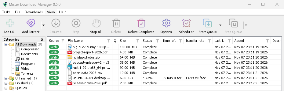
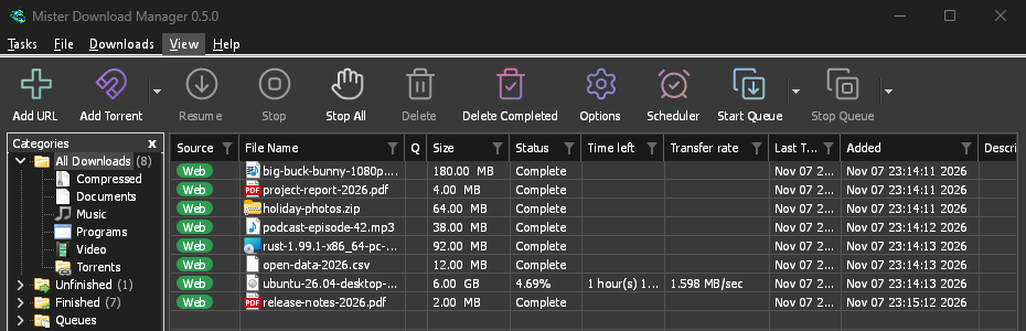
クラシック
GDM's own look and the default: the layout IDM users know, with Windows 11's controls.
-
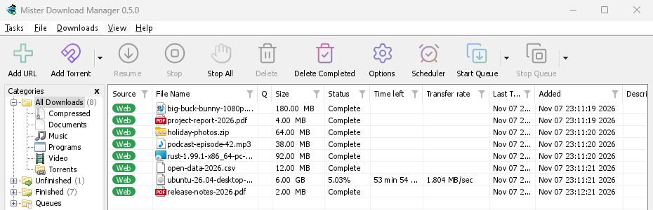
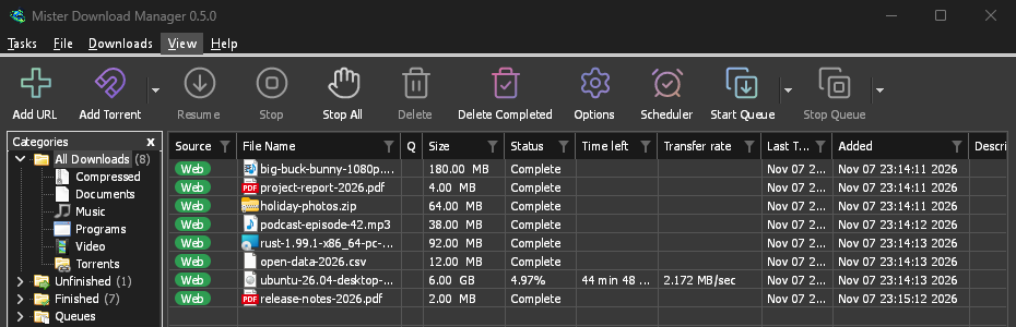
ネイティブ
Windows、Linux、macOS で、システムのアクセント カラーとコントラスト設定が変更されると、それに合わせて GDM の見た目も変わります。
-
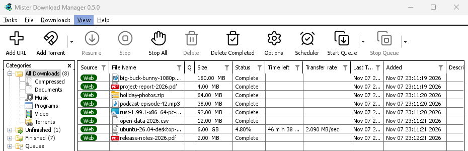
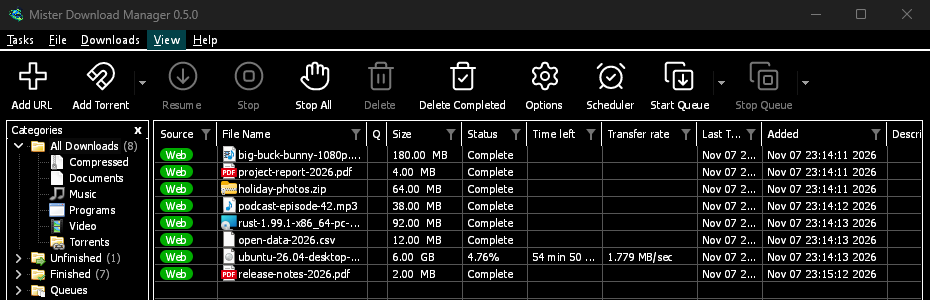
ハイ コントラスト
白黒、明るいアクセント、すべてのエッジが描画され、テキストのコントラスト比は 7:1 以上です。
-
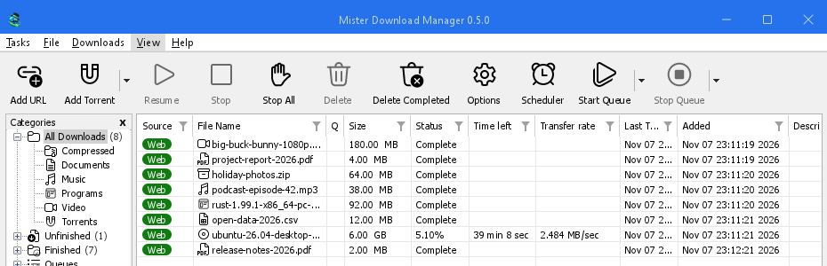
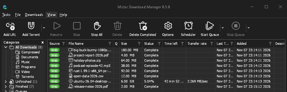
メトロ
Windows 8 のフラットな見た目: 角が四角く、フラットなボタンと単色のアイコンが特徴です。
-
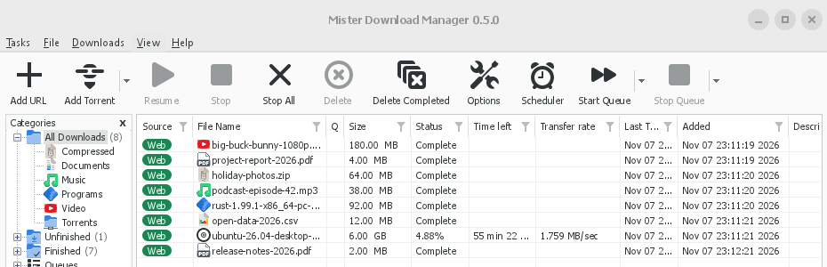
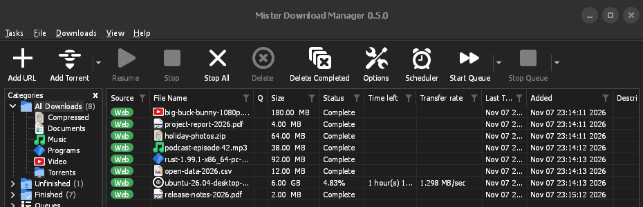
Adwaita
GNOME の見た目: 丸い角、フラットなグレーのボタン、丸いフォーカス リング、ヘッダー バーが特徴です。
-
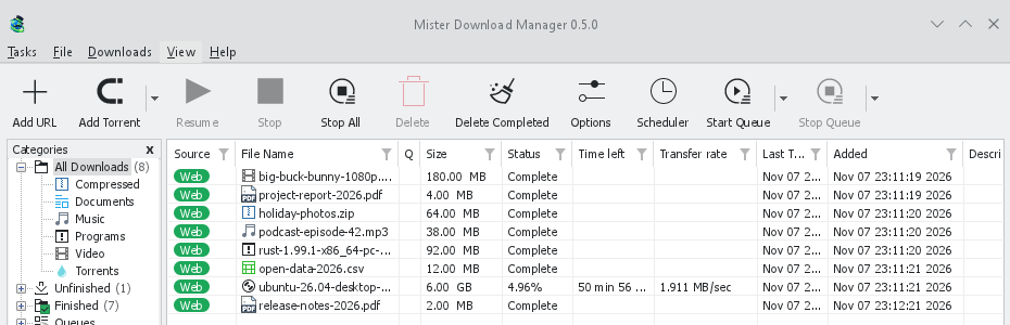
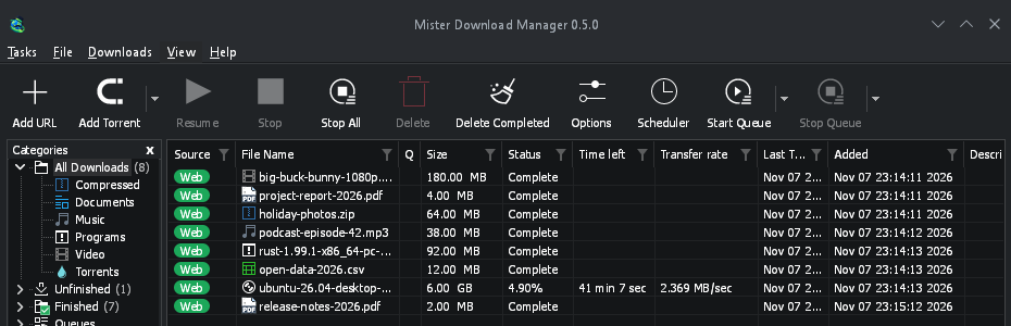
Breeze
KDE Plasma の見た目: 丸い角、アクセントのエッジを取るコントロール、KDE のアイコンが特徴です。
-
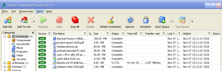
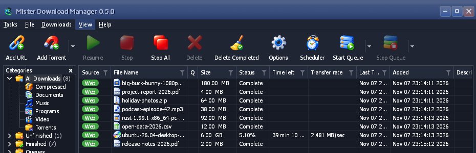
Luna
Windows XP の雰囲気: オレンジ色の光沢がある陰影付きボタン、緑色のチェックマーク、深い青色のタイトル バーが特徴です。
-
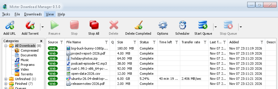
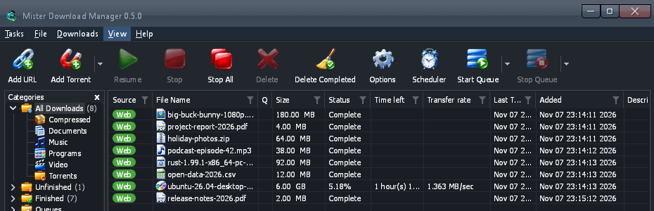
Aero
Windows 7 の雰囲気: 光沢のあるボタン、ガラスのようなタイトル バー、光沢のある緑色のプログレス バーが特徴です。
-
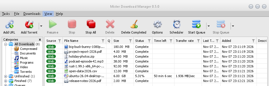
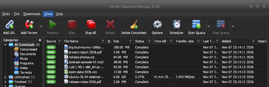
Aqua
Mac OS X の雰囲気: 端が丸いジェル ボタン、青いフォーカス リング、青いジェルのプログレス バーが特徴です。
- 独自のテーマを作成色とサイズを記述したテキスト ファイルで、数秒で試せます。3 つのステップで作成できます。
独自のテーマを作成
A theme is one small text file, in TOML (or JSON). It names only what it changes; everything else comes from the theme it builds on. You don't need to build GDM or know how to program.
作成
まずいくつかの色から始め、必要に応じて追加していきます。
name = "Harbour" inherits = "classic" icons = "color" [seeds.light] background = "#eef3f6" surface = "#ffffff" text = "#11202b" accent = "#0f6c8c" [seeds.dark] background = "#14212a" surface = "#0e171d" text = "#e8f0f4" accent = "#5cc3e6" [sizes] radius = 6 [controls] focus = "ring"inheritsはテーマの基になるテーマです:classic(既定)、high-contrast、metro、adwaita、breeze、luna、aero、aqua、または同じフォルダー内の別のテーマ ファイル。[seeds]are a handful of colours (background,surface,header,text,accent,selection,error,warning,success) that GDM spreads over every control.[seeds.light]and[seeds.dark]give each side its own.[colors]は両方のモードで単一の色の役割を設定し、[light]と[dark]は片方のモードのみで設定します:#rrggbb、または透明度を持つ#rrggbbaa。[sizes]は、ピクセル単位の角の半径、境界線の幅、フォント サイズ、行の高さです。[controls]は、テキスト ボックス、チェック ボックス、ボタン、プログレス バー、スクロール バー、フォーカス マーク、タイトル バーの形状を選択します。iconscolor、mono、accentのいずれかです。独自のフォルダー (my-theme/theme.toml) にあるテーマは、icons/16とicons/24にアイコンを含めることができ、それぞれ表示される内容 (tb-add-url.svg、cat-music.png) に合わせて名前が付けられます。-symbolicのアイコンはテーマのテキストの色を使用します。contrast = "high"すべてのエッジとテキストの色を強調します。
A key GDM doesn't know, or a value it can't read, is skipped and written to GDM's log (the
logsfolder beside the themes folder), so a file made for a newer GDM still loads. The built-in themes are written the same way: read them on GitHub.すべての色の役割 (156)
キー 色付けの対象 windowWindows とダイアログの背景 textテキストとグリフ text.disabled無効なテキスト、グレー表示されたすべてのコントロールとラベルのグレー text.muted補助テキスト: メモ、サイズ、バージョン link何かを開くテキスト errorエラー テキスト error.strongオプションでのチェック失敗メッセージ (接続、ブラウザー、ヘルパーのテスト) warning警告テキスト success成功テキスト (一致するチェックサム) reach.nearプロパティで、ラウンドトリップ時間が短い (60 ミリ秒未満) ダウンロード サーバー reach.mediumラウンドトリップ時間が中程度 (60 ~ 150 ミリ秒) のサーバー reach.farラウンドトリップ時間が長い (150 ミリ秒超) サーバー flag.edge国旗の周りの細い枠線 accentアクセント: フォーカス線、開いているコントロールと既定のコントロール、フィルター、リンクのフォーカス focus.ring点線のキーボード フォーカス矩形 selection選択範囲の塗りつぶし: 行、選択された日付、選択されたテキスト selection.text選択範囲上のテキスト selection.muted選択範囲上の補助テキスト selection.inactiveフォーカスがないリスト内の選択された行 selection.focus選択された行上の、フォーカスされた行の点線のアウトライン group.lineグループ ボックスのフレーム etch.shadowエッチングされた区切り線の影の線 etch.lightエッチングされた区切り線のハイライト線 tab.pageタブ ページの本文 tab選択されていないタブとページの影 tab.hotポインターの下にあるタブ chevronドロップダウンまたはスピン ボックスの矢印 chevron.disabledグレー表示された矢印 subtle.hotポインターの下にある、それ自体の表示がない部分 (矢印、列ヘッダー) subtle.pressed押されているか開いている部分 highlight.hotポインターの下にあるカレンダーの日付または矢印、ドロップ ターゲット highlight.pressed押されているカレンダーの日付または矢印 fieldテキスト ボックスまたはリストの内部 field.borderテキスト ボックスの境界線 field.bottom入力可能なテキスト ボックスの下線 field.disabledグレー表示されたテキスト ボックスの内部 field.disabled.borderグレー表示されたテキスト ボックスの境界線 field.readonly読み取り専用テキスト ボックスの内部 field.readonly.border読み取り専用テキスト ボックスの境界線 combo.chevronドロップダウンの山形記号 combo.arrow.hotポインターの下にある編集可能なドロップダウンの矢印ゾーン combo.arrow.pressed押されているか開いている編集可能なドロップダウンの矢印ゾーン buttonボタンの面 button.hotポインターの下にあるボタンの面 button.pressed押されているボタンの面 button.borderボタンの境界線 button.bottomボタンの下端 button.textボタンのテキスト button.text.pressed押されているボタンのテキスト button.default.border既定のボタンの境界線 button.default.bottom既定のボタンの下端 button.disabledグレー表示されたボタンの面 button.disabled.borderグレー表示されたボタンの境界線 button.accentアクセント ボタンの面 button.accent.hotポインター下のアクセント ボタンの面 button.accent.pressed押されたアクセント ボタンの面 button.accent.bottomアクセント ボタンの下端 button.accent.textアクセント ボタンのテキスト button.accent.text.pressed押されたアクセント ボタンのテキスト button.glowポインター下のボタンの内側の光彩 (スタイルで描画される場合: Luna; 透明: なし) glossボタン、ボックス、バー、タイトル バーの上部で光沢のある部分がブレンドされる輝き (Luna、Aero、Aqua) checkチェックなしのボックスまたはラジオ ボタンの内側 check.hotポインター下の内側 check.pressed押された内側 check.borderチェックなしのボックスまたはラジオ ボタンの境界線 check.border.hotポインター下の境界線 check.border.pressed押された境界線 check.border.disabledグレー表示されたチェックなしのボックスの境界線 check.onチェックされたボックスまたはラジオ ボタンのアクセント check.on.hotポインター下のチェックされたアクセント check.on.pressed押されたチェックされたアクセント check.on.disabledグレー表示されたチェックされたボックスの塗りつぶし check.markチェックされたアクセントのチェック マークまたは点 progress.trackプログレス バーのトラック progress.barプログレス バーの塗りつぶし meter.trackメーターのトラック (ダウンロードの完了部分) meter.edgeメーターの端 meter.fillメーターの塗りつぶし listダウンロード リストの背景 list.frameリスト、テーブル、またはボックスの輪郭 gridダイアログのリストの行間のグリッド線 list.gridダウンロード リストのグリッド線 headerすべてのリストとテーブルの列ヘッダー header.lineダイアログのリストのヘッダーの下線 header.sep列ヘッダー間の区切り線 table.lineリンク グラバーとトレント追加のテーブルの区切り線 header.sortedソートされた列のヘッダー header.sort-arrowソートの山形記号 row.pressedリストの行が押された状態 chip.webダウンロード リストの Web チップ chip.torrentダウンロード リストのトレント チップ chip.textチップ上のテキスト list.drag-ghostドラッグ中の列ヘッダー list.marquee行を選択するラバーバンド list.marquee.borderラバーバンドの端 scroll.trackスクロール バーのトラック scroll.corner2 つのスクロール バーが交わる場所 scroll.thumbスクロール バーのつまみと矢印 scroll.thumb.hotポインターの下にあるつまみまたは矢印 scroll.thumb.pressed押下またはドラッグ中のつまみまたは矢印 menubarメニュー バー menubar.bottomメニュー バーの最後の行 menubar.lineメニュー バーの下の線 menubar.hotポインターの下にあるメニュー タイトル menubar.open開いているメニューのタイトル menuメニューの背景 menu.itemメニュー項目 menu.hotポインターの下にあるメニュー項目 menu.borderメニューとポップアップのフレーム menu.sepメニューの区切り線 menu.textメニューのテキスト menu.glyph箇条書き、チェック マーク、サブメニューの矢印 menu.text.disabledグレー表示されたメニュー項目 toolbar.lineツールバーの最上行 toolbar.line.lightその下のハイライト toolbar.hotポインターの下にあるツールバー ボタン toolbar.hot.faint分割ボタンの片方がポインターの下にあるときの、もう一方の部分 toolbar.pressed押されたツールバー ボタン toolbar.hot.edgeホット ツールバー ボタンの端 toolbar.hot.borderホット ツールバー ボタンの境界線 (透明: なし) toolbar.split.shadow分割ボタンの区切り線 (静止時): その影 toolbar.split.light区切り線のハイライト toolbar.text.disabledグレー表示されたツールバー ラベル toolbar.arrowドロップダウン ボタンの矢印 icon.disabledグレー表示されたアイコンのインク (開始) icon.disabled.endグレー表示されたアイコンのインク (終了) treeカテゴリ ツリーの背景 tree.linesツリーの点線コネクタ tree.expanderツリーのシェブロン (バリアントが描画する場合) tree.frameカテゴリ ペインのフレーム progress.status進捗状況ウィンドウの「状態」の値 progress.label.disabled進捗状況ウィンドウのグレー表示されたラベル segments.borderセグメント バーのフレーム segments.cornerセグメント バーの角のピクセル pieces.haveここにあるトレント ピース pieces.partial部分的にここにあるピースを表す四角形 pieces.missingまだここにはないピース captionA title bar MDM draws itself caption.textそのタイトルとグリフ caption.text.inactiveウィンドウがアクティブでないときのタイトルとグリフ、およびグレー表示されたボタンのタイトルとグリフ caption.hotポインターの下にあるキャプション ボタン (バー上の色合い) caption.pressed押されたキャプション ボタン (バー上の色合い) caption.button静止状態のキャプション ボタン (スタイルが表示する場合) (バー上の色合い; 透明: なし) caption.closeポインターの下にある「閉じる」 caption.close.textポインター下の[閉じる]のグリフ caption.inactiveA title bar MDM draws, while its window isn't the active one (transparent: as when active) drop-target.edgeドロップ ターゲットの静止時のエッジ egui.panelegui のパネルの背景 egui.windowツールヒントの背景 egui.window.borderツールヒントの境界線 egui.textツールヒントのテキスト egui.selection.textegui のボックス内の選択されたテキストの色 egui.extremeegui の最も暗い (または最も明るい) 背景 egui.faintegui の薄い背景 egui.widgetegui のウィジェット (静止時) egui.widget.borderその境界線 (透明: なし) すべてのサイズ (26)
キー 設定内容 radiusボタン、テキスト ボックス、ドロップダウンの角の半径 radius.button光沢のあるプッシュ ボタンの角の半径 (Luna、Aero; Aqua は端が丸い) radius.part色付き部分 (矢印ゾーン、スピン ボタン) の角の半径 radius.checkチェック ボックスの角の半径 radius.flyoutウィンドウ内のポップアップ (カレンダー、フィルター ボックス) の角の半径 radius.menu-itemポインター下のメニュー項目の角の半径 radius.eguiegui 独自のウィジェットの角の半径 radius.popupツールヒントの角の半径 borderコントロールの境界線の幅 focus-lineフォーカスされたテキスト ボックスのアクセント ラインの高さ chevron.widthドロップダウンのシェブロンのストローク幅 font.dialogダイアログ テキスト (IDM のダイアログでは Tahoma) font.dialog.boldオプション ページのタイトル font.titleウィンドウの見出し (Tahoma Bold): ブラウザー拡張機能、ヘルパー font.codeサービス ページで入力するサインイン コード font.uiメニューとメイン ウィンドウのテキスト (Segoe UI) font.ui.boldメイン ウィンドウの太字の見出し font.smallegui の小さいテキスト font.bodyegui の本文テキスト: ツールチップ、複数行ボックス font.headingegui の見出し list.rowダウンロード リストの行の高さ list.headerダウンロード リストの列ヘッダーの高さ tooltip.widthツールチップのテキストが折り返される位置 tooltip.margin-xツールチップの左右のパディング tooltip.margin-topツールチップの上部のパディング tooltip.margin-bottomツールチップの下部のパディング すべてのコントロール スタイル (7)
キー そのスタイル field-focus線、境界線、リング checkfluent, square, adwaita, breeze, luna, aero, aqua buttonfluent, breeze, luna, aero, aqua progress線、バー、ブロック、光沢 scrollオーバーレイ、クラシック captionシステム、metro、adwaita、breeze、luna、aero、aqua focus点線、リング、フレーム または AI アシスタントに作成させる
このプロンプトを AI アシスタントにコピーし、最後に希望する外観を記述してください。アシスタントに形式、キー、ルール (両側で読みやすいテキストと目に見えるフォーカス、他のアートワークからのコピーなし) を伝えます。結果を共有する前に、両側を自分で確認してください。
You are making a theme file for GolinksPRO Download Manager (GDM), a free, open-source download manager. Write one TOML file, named after the theme in lower case with dashes (for example harbour.toml). Reply with the file only, in one code block, then one line on how to install it.

THE FORMAT
A theme names only what it changes; everything else comes from the theme it inherits.
- name = "Display name"
- inherits = "classic" (the default), "high-contrast", "metro", "adwaita", "breeze", "luna", "aero" or "aqua"
- icons = "color" | "mono" | "accent"
- contrast = "high" (optional: strengthens every edge and text colour)
- [seeds] a few colours GDM spreads over every control: background, surface, header, text, accent, selection, error, warning, success. Use [seeds.light] and [seeds.dark] to give each side its own.
- [colors] single colour roles for both sides; [light] and [dark] for one side only. Role names are dotted and must be quoted when they contain a dot, e.g. "button.hot" = "#e5f1fb". Useful roles: window, text, text.muted, link, accent, focus.ring, selection, selection.text, field, field.border, button, button.hot, button.pressed, button.border, button.text, check.on, check.mark, progress.bar, list, header, menubar, menu, menu.hot, menu.text, toolbar.hot, tree, caption, caption.text, scroll.thumb, gloss (the shine glossy parts blend toward), button.glow. "segments.done" takes one colour or a list of 13 (top to bottom).
- [sizes] in pixels, 0 to 400: radius, radius.button, radius.check, radius.menu-item, radius.popup, border, focus-line, list.row, list.header, font.ui, font.dialog.
- [controls] shapes: field-focus = line | border | ring; check = fluent | square | adwaita | breeze | luna | aero | aqua; button = fluent | breeze | luna | aero | aqua; progress = line | bar | blocks | gloss; scroll = overlay | classic; focus = dotted | ring | frame; caption = system | metro | adwaita | breeze | luna | aero | aqua.
- Colours are "#rrggbb" or "#rrggbbaa". Unknown keys are skipped, so only use the names above.

THE RULES
1. Make both a light and a dark side: give [seeds.light] and [seeds.dark] (or [light] and [dark]) their own colours, and check each side on its own.
2. Text must be easy to read: at least 4.5:1 contrast for text against its background (text on window and field, button.text on button, menu.text on menu, selection.text on selection, caption.text on caption), in both sides.
3. The keyboard focus must be easy to see: accent and focus.ring at least 3:1 against what they sit on.
4. Disabled text stays readable but clearly dimmer than normal text.
5. Clean room: no artwork, icons, logos, fonts or text copied from any other program or company. If the theme needs icons, describe original ones to draw, never copy existing ones, and note their source and licence in a SOURCES.txt.
6. Keep the layout: a theme changes colours, sizes and control shapes only.

After the file, list each text and background pair you checked with its contrast ratio, for both sides.

THE LOOK I WANT:
Try it, without building GDM
Put the file in GDM's themes folder. View → Theme → Open themes folder opens it, and makes it the first time. It is in GDM's data folder:
- Windows
%APPDATA%\misterdownloadmanager\themes- Linux
~/.local/share/misterdownloadmanager/themes- macOS
~/Library/Application Support/misterdownloadmanager/themes- ポータブル コピー
data\themesプログラムの横
2 秒以内に、表示 → テーマ に、組み込みテーマの下に、
nameが自動で付与されて表示されます。それを選択すると、ウィンドウ全体が一度に変わります。ファイルを編集した後、変更を確認するには 表示 → テーマ で再度選択します。表示 → ダーク モードのサポート と 常にダーク で、ライト側とダーク側を切り替えます。View → Theme → Add a theme file… does it for you: pick the file anywhere, and GDM copies it into the themes folder and uses it at once.
Base16 または pywal スキームをお持ちですか?
It's a theme already. A Base16 or Base24 scheme (
.yaml) or pywal'scolors.json, added the same way, changes GDM's colours and nothing else: the scheme's backgrounds behind the list and the windows, its text kept readable (4.5:1 or more), its blue on the focus, the selection and the progress bar. Oncewalhas run, View → Theme lists pywal, read from~/.cache/wal/colors.json(%USERPROFILE%\.cache\wal\colors.jsonon Windows), and GDM follows each new wallpaper's colours within two seconds. The guide shows which colour goes where.
無料、オープンソース、広告なし、試用期間なし。
Download GolinksPRO Download Manager